Part of the joy of being a translator is coming across deliciously juicy words that are seemingly alike in two given languages. At first glance, that is. An experienced translator usually knows how to navigate the sea of Latinate false cognates and lexis, though the color spectrum is at times less than discernible.
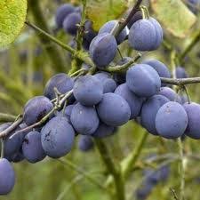
I was recently translating an unauthored art-related piece from English into Italian and the writer went out of his/her way to find appropriate words to describe colors. One of these colors was damson, a purplish hue whose name stems from the plum by the same name. The skin of a Damson plum (archaically a damascene, meaning from Damascus) is in fact dark blue or indigo. In Italian, prugna is often used to describe a shade of purple. But is it the same color?


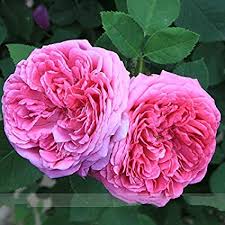
Judging by the pictures, they do not seem to conjure up the same shade of purple: damson seems to be a cooler shade than prugna. To make matters worse, Italian has two adjectives (or demonyms) derived from Damascus: damaschino and damasceno. An educated guess, to stick closer to the English damson, would be to opt for damaschino since the type of plum is usually called prugna or susina damaschina. This despite the fact that damaschino in Italian also refers to a type of white grape. But let’s not get embroiled in it. On the other hand, damasceno in Italian only seems to collocate primarily with a kind of rose, the beautiful rosa damascena (Damask rose). We can thus safely rule it out since its color is usually pink or red.

Besides being damson, the lips described in the piece also happened to be sumptuous. While this is a possible collocation in English, labbra sontuose simply won’t fly in Italian since sontuoso (or suntuoso) usually collocates with decor, buildings or furnishings.
So what would be a good collocation in Italian? Because ‘sumptuous’ implies lusciousness and something that is appealing to the senses, perhaps labbra carnose or labbra turgide could do the trick.

Also, damson lips seems to occur rather frequently in literature, but a similar search in Italian does not seem to generate any results. However, a few examples using labbra color prugna do exist.
In the final analysis, should translators go for precision or collocational usage? It probably depends on the type of text and target readership involved. I tend to like precision. So what if most readers need to stop and look up a word they have not encountered before? However, would labbra color prugna damaschina work? Is it too long or contrived? Another strategy would be to just leave prugna for the sake of brevity or opt for a different word that may be closer in shade. In this case, indaco, indigo, might do the job.
Translators are often bound to hit a chromatic snag. When it comes to translating colors, specific shades are often perceived differently by creative writers and copywriters alike. The onslaught of marketed goods online keeps compounding matters by using colors imprecisely. When a picture is incorporated into the text, things are somewhat smoothed over, but in the absence of any photographic support, translators will need to look at strategies to circumvent the problem.
